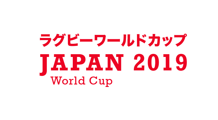
After the original logos weren't as good as i first thought we decided to go back and try and create something different, thinking about having something more solid and bold that stands out.
I started to think that we should probably have something that just focused on type, as this would allow it to be placed in a number of places and locations and sizes and still be recognisable, it also allows us to use both english and japanese typefaces together.
I decided to choose quite a bold Japanese typeface again so it stands out and doesn't look to thin next to the english typeface.
I decided to look at a serif typeface but i thought it didn't work as well with the Japanese typeface, they sort of blend together whereas the sans serif doesn't do this.
I then thought that maybe i could tilt the 0 so that it gave reference to a rugby ball.
These are the final 2 logos i could decide if i should have the rugby ball shape or not.


No comments:
Post a Comment