I looked at grey board because i had found some of this in the bin and it was also the right size to what i wanted to create so it was perfect for a cover.


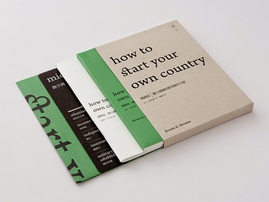
I started to look at contrasting stocks because i had collected a range of different colours of paper form the bins in the studio, so i wanted to see how different coloured stocks might look in books.


Contrast in coloured stocks across 2 pages, these could be used as quotes across the pages to split up text.
After this I looked into different scrap books to see how they were bound together, although they look very rough and ready and mine won't be this rough because the paper i have is all cut down to A4 to be printed on A5 so the edges will be smooth. It does give me an idea of how i could bind them and how they might be used.


No comments:
Post a Comment